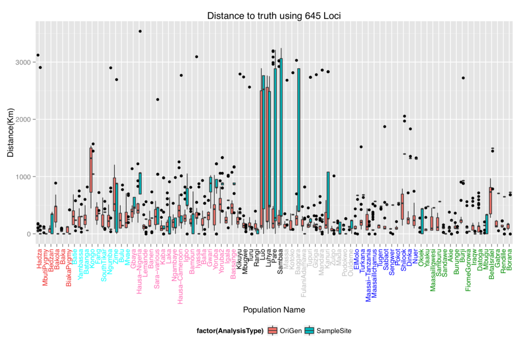
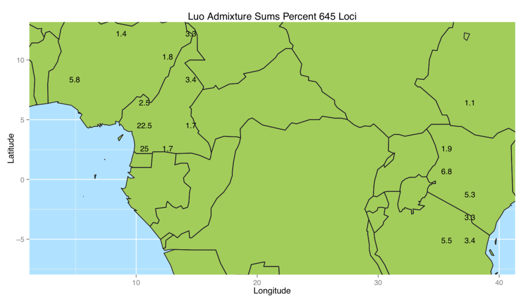
In this project, we formulated a method to place populations back onto their geographical locations on a map using only their genetic data. We tested the method using a leave one sample site out procedure on the African portion of the Human Genome Diversity Project data. For comparison, we included one which places individuals back onto the sample site of their closest genetic relative. The results are shown in the first box and whiskers plot. There were some populations that performed very poorly in both methods. We hypothesized that the poor placement may be due to admixture since these particular populations have a history of being invaded by the Bantu. So modified the ADMIXTURE model to work with our method. This entailed adding in a Lasso penalty to the model and maximizing the modified loglikelihood. The map figure shows the admixed placement of the Luo population which shows that a large portion of their genetics comes from the west side of the region and another portion comes from the east.
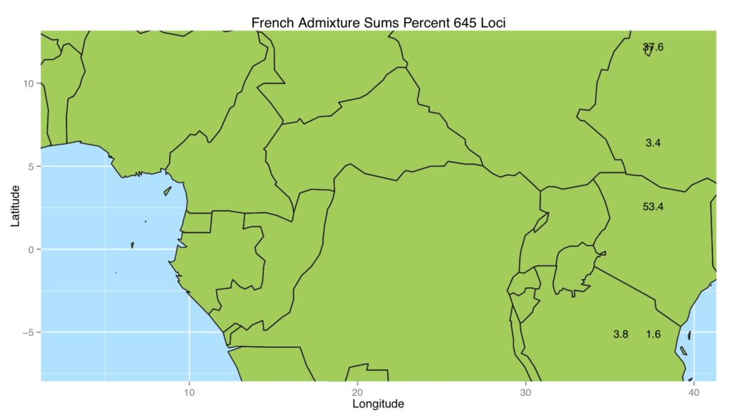
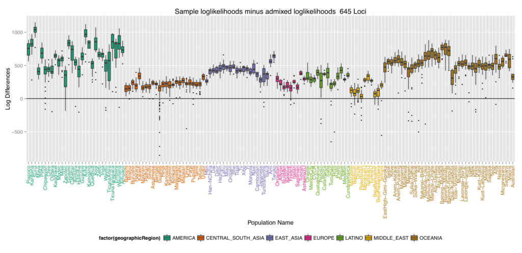
We decided to see what happens when we placed non-African populations back into Africa using the admixture method. The results were quite interesting in that most of the populations genetics came from two areas shown in the next map figure (French shown). To quantify how well the different worldwide populations were placed back into Africa, we turned to log differences. The final box and whiskers plot which plots these log differences is interesting because it alludes to the out of Africa migration with the ones closest to 0 (the most well placed ones) being the first regions settled and the furthest ones from 0 being the later regions settled.


